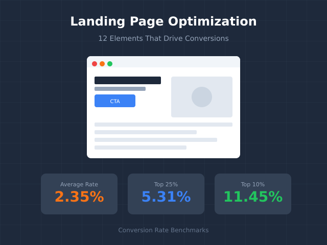
The average landing page converts at 2.35%. The top 10% convert at 11.45% or higher. That’s a 5x difference—and it comes down to getting the fundamentals right. This guide covers the 12 elements that separate high-converting landing pages from the ones that leak money.
Why Most Landing Pages Underperform
Landing pages fail for predictable reasons. Too many CTAs. Slow load times. Headlines that talk about features instead of outcomes. Forms that ask for everything except a blood sample. The fix isn’t complicated—it’s systematic.
Landing page optimization means removing friction between your visitor’s intent and your conversion goal. Every element on the page either moves them closer to action or pushes them away. There’s no neutral ground.
One page, one purpose, one call to action. Complexity kills conversions.
The elements below are ranked by impact. Start at the top if you’re building from scratch. Start wherever you’re weakest if you’re optimizing an existing page.
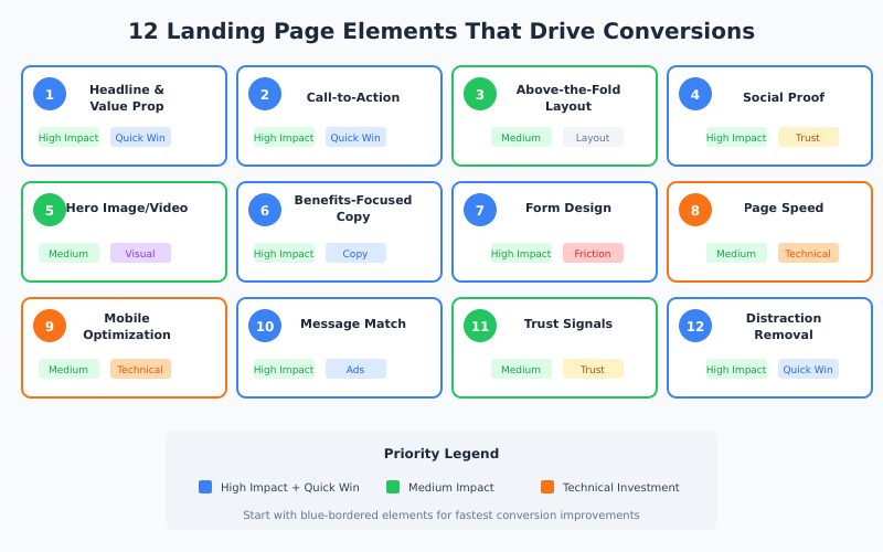
The 12 Elements at a Glance
| # | Element | Impact Area | Quick Win Potential |
|---|---|---|---|
| 1 | Headline & Value Proposition | First impression, clarity | High |
| 2 | Call-to-Action (CTA) | Direct conversion | High |
| 3 | Above-the-Fold Layout | Engagement, bounce rate | Medium |
| 4 | Social Proof | Trust, credibility | High |
| 5 | Hero Image or Video | Emotional connection | Medium |
| 6 | Benefits-Focused Copy | Persuasion | High |
| 7 | Form Design | Lead capture friction | High |
| 8 | Page Speed | Bounce rate, SEO | Medium |
| 9 | Mobile Optimization | 50%+ of traffic | Medium |
| 10 | Message Match | Ad-to-page continuity | High |
| 11 | Trust Signals | Risk reduction | Medium |
| 12 | Distraction Removal | Focus, clarity | High |
1. Headline and Value Proposition
Your headline is the hook. If it’s weak, visitors won’t stick around to read anything else. In my experience testing headlines across dozens of landing pages, a strong headline can lift conversions by 20-30% on its own.
An effective headline answers one question immediately: “What do I get and why should I care?”
What Makes a High-Converting Headline
- Specific outcome: “Increase Your Email Open Rates by 47%” beats “Better Email Marketing”
- Addresses the visitor directly: Use “you” and “your”
- Creates urgency or curiosity: Without being clickbait
- Matches the ad or link that brought them here: Consistency builds trust
Headline Formulas That Work
| Formula | Example |
|---|---|
| [Action] + [Timeframe] + [Outcome] | “Build Your First App in 30 Days—No Coding Required” |
| [Problem] → [Solution] | “Tired of Spreadsheet Chaos? Automate Your Reports” |
| [Number] + [Benefit] | “12 Templates That Convert 3x Better Than Industry Average” |
| How to [Achieve Desired Result] | “How to Cut Your Customer Acquisition Cost in Half” |
Your subheadline should expand on the promise. If the headline is the hook, the subheadline is the explanation. Keep it under 20 words.
2. Call-to-Action (CTA)
You can’t capture leads without a call-to-action button. It’s the most important element on your landing page—the moment of conversion or abandonment.
However, many landing pages dilute their CTAs. Multiple buttons. Competing actions. Vague copy. Every additional CTA reduces the effectiveness of the primary one.
CTA Best Practices
- One primary CTA per page: Repeat it, don’t compete with it
- Action-oriented copy: “Get My Free Guide” beats “Submit”
- First-person language: “Start My Trial” outperforms “Start Your Trial” by 90% in some tests
- Contrasting color: The button should visually pop without clashing
- Above and below the fold: Visible without scrolling, repeated for long pages
CTA Copy Examples
| Weak CTA | Strong CTA | Why It Works |
|---|---|---|
| Submit | Get My Free Quote | Describes what they receive |
| Click Here | Start Saving Today | Outcome-focused |
| Learn More | See How It Works | Specific action |
| Sign Up | Create My Account | First-person ownership |
Test your CTA relentlessly. It’s often the highest-impact element to optimize. For a structured approach to testing, see our A/B testing statistical significance guide.
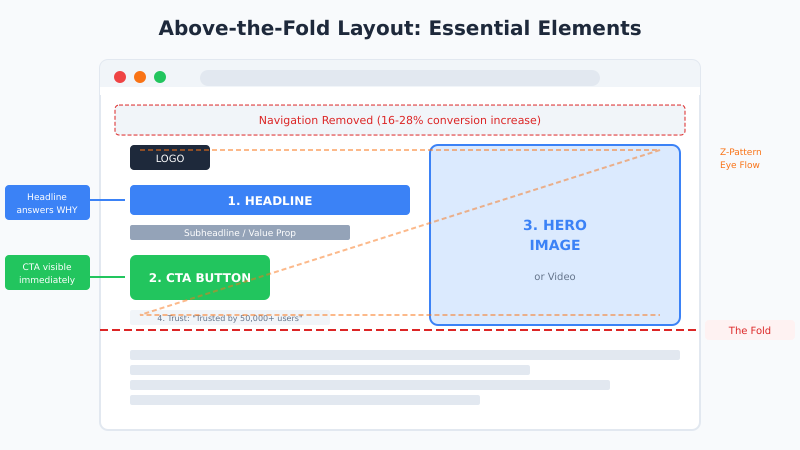
3. Above-the-Fold Layout
The area visible without scrolling determines whether visitors engage or bounce. You have roughly 5 seconds to communicate value and relevance.
Above the fold must include:
- Headline and subheadline
- Primary CTA button
- Hero image or video (or the beginning of it)
- One key trust signal (optional but effective)
Everything else can wait. Don’t cram your entire pitch above the fold—just enough to earn the scroll.
Layout Patterns That Convert
The most effective above-the-fold layouts follow predictable patterns:
- Z-pattern: Logo (top-left) → Navigation (top-right) → Headline (left) → CTA (right)
- F-pattern: Headline across top → Supporting copy left-aligned → CTA prominent
- Single-column: Centered headline → Hero image → Centered CTA
Remove navigation menus on landing pages. Studies show this can increase conversions by 16-28%. Your landing page has one job—don’t give visitors escape routes.
4. Social Proof
People look to others when making decisions. Social proof reduces perceived risk and validates the choice to convert. In fact, adding testimonials to a landing page can increase conversions by up to 34%.
Types of Social Proof (Ranked by Impact)
- Customer testimonials with photos and names: Specific results (“increased revenue by 43%”) beat vague praise
- Case studies or success stories: Detailed proof for high-consideration purchases
- Client logos: Especially effective for B2B (“Trusted by teams at Google, Slack, and Shopify”)
- Review scores: Star ratings, G2/Capterra badges, NPS scores
- User counts: “Join 50,000+ marketers” signals popularity
- Media mentions: “As featured in Forbes, TechCrunch…”
Social Proof Placement
Place social proof near decision points—close to CTAs and forms. A testimonial right above a signup button can be the final push a hesitant visitor needs.
Don’t use stock photos for testimonials. They destroy credibility instantly. Real photos of real customers outperform polished headshots.
5. Hero Image or Video
Your hero shot is the primary visual above the fold. It’s the first thing visitors focus on, so it needs to work hard.
What Works
- Product screenshots or demos: Show what they’re getting
- People using the product: Creates emotional connection
- Before/after visuals: Powerful for transformation-based offers
- Short explainer videos: Can increase conversions by 80%+ (but must load fast)
What Doesn’t Work
- Generic stock photos: Smiling people in suits shaking hands? Skip it.
- Unrelated abstract imagery: If it doesn’t support the message, cut it
- Autoplaying videos with sound: Visitors will leave immediately
If using video, keep it under 90 seconds. Include captions—most visitors watch without sound. And always have a fallback image for slow connections.
6. Benefits-Focused Copy
Features describe what your product does. Benefits describe what the customer gets. Landing pages that focus on benefits consistently outperform feature-heavy pages.
Feature vs. Benefit
| Feature | Benefit |
|---|---|
| 256-bit encryption | Your data stays private and secure |
| 24/7 customer support | Get help whenever you need it |
| AI-powered analytics | Make smarter decisions in less time |
| Integrates with 50+ tools | Works with the apps you already use |
Copywriting Tips
- Lead with outcomes: What changes in their life or business?
- Use specific numbers: “Save 10 hours per week” beats “save time”
- Address objections: “No credit card required” removes friction
- Keep paragraphs short: 2-3 sentences maximum
- Use bullet points: Scannable content performs better
Write at an 8th-grade reading level. Complex language doesn’t impress—it confuses. Tools like Hemingway Editor can help simplify your copy.
7. Form Design
Every form field is a barrier. The more you ask for, the fewer people complete it. This is one of the highest-impact areas for landing page optimization.
Form Optimization Rules
- Ask only what you need: Name and email for top-of-funnel. More fields for sales-qualified leads.
- Use single-column layouts: Faster to complete, fewer errors
- Show progress for multi-step forms: “Step 1 of 3” reduces abandonment
- Use inline validation: Real-time feedback prevents frustration
- Make CTAs specific: “Get My Free Report” not “Submit”
Field Count Impact
| Fields | Typical Conversion Impact |
|---|---|
| 1-2 fields | Highest conversion rate |
| 3-5 fields | Moderate drop-off |
| 6-10 fields | Significant friction |
| 10+ fields | Major abandonment risk |
Consider progressive profiling—collect basic info first, then gather more details over subsequent interactions. You don’t need everything on day one.
8. Page Speed
Every second of load time costs you conversions. Walmart found that for every 1-second improvement in load time, conversions increased by 2%. Google reports that 53% of mobile visitors leave pages that take longer than 3 seconds to load.
Speed Optimization Checklist
- Compress images: Use WebP format, aim for under 100KB per image
- Minimize HTTP requests: Fewer scripts, stylesheets, and fonts
- Enable browser caching: Return visitors load faster
- Use a CDN: Serve assets from locations near your visitors
- Lazy load below-fold images: Don’t load what isn’t visible yet
- Optimize Core Web Vitals: LCP under 2.5s, CLS under 0.1, FID under 100ms
Test your page with Google PageSpeed Insights and address critical issues first. For detailed performance optimization, see our Core Web Vitals guide.
9. Mobile Optimization
Over 50% of web traffic is mobile. If your landing page isn’t optimized for phones, you’re losing half your potential conversions.
Mobile-First Design Principles
- Thumb-friendly buttons: Minimum 44×44 pixels, easy to tap
- Readable text without zooming: 16px minimum font size
- Single-column layout: No horizontal scrolling
- Sticky CTA: Keep the action button visible while scrolling
- Simplified forms: Use appropriate input types (email, tel, number)
- Click-to-call buttons: Essential for phone-based conversions
Test on actual devices, not just browser emulators. What looks fine in Chrome DevTools might be unusable on a real phone.
10. Message Match
Message match means continuity between your ad and your landing page. When someone clicks an ad promising “50% off running shoes,” they expect to land on a page about discounted running shoes—not your homepage.
Why Message Match Matters
Poor message match causes immediate bounces. Visitors feel misled, even if unintentionally. They clicked expecting X and got Y. Trust breaks before it forms.
Message Match Checklist
- Headline mirrors ad copy: Same language, same promise
- Visuals are consistent: If the ad shows a product, the page shows that product
- Offer is identical: Same discount, same free trial length, same bonus
- Design feels connected: Similar colors, fonts, and imagery
Create dedicated landing pages for different ad campaigns. Sending all traffic to one generic page wastes ad spend and tanks conversion rates.
11. Trust Signals
Beyond social proof, trust signals reduce perceived risk at the moment of conversion. They answer unspoken objections: “Is this safe? Will I regret this?”
Effective Trust Signals
- Security badges: SSL certificates, payment processor logos (Stripe, PayPal)
- Money-back guarantees: “30-day full refund, no questions asked”
- Privacy assurances: “We never share your email” near form fields
- Industry certifications: SOC 2, GDPR compliance, BBB accreditation
- Contact information: Real address, phone number, live chat
Place trust signals near conversion points. A security badge next to a payment form reduces cart abandonment. A privacy note near an email field increases signups.
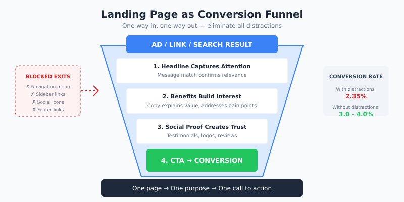
12. Distraction Removal
What you remove from a landing page matters as much as what you add. Every link, image, or piece of text that doesn’t support the conversion goal is a potential leak.
What to Remove
- Main navigation: Links to other pages = exit opportunities
- Sidebar content: Pulls attention from the primary message
- Footer links: Keep only essential legal links
- Multiple offers: One page, one conversion goal
- Social media icons: Don’t send visitors away to scroll Instagram
- Unrelated content: Blog posts, news, company updates
Think of your landing page as a tunnel, not a hub. There’s one way in (your ad or link) and one way out (your CTA). Everything else is a distraction.
How to Prioritize Your Optimization Efforts
You can’t fix everything at once. Use this framework to prioritize based on impact and effort:
High Impact, Low Effort (Do First)
- Headline rewrite
- CTA button copy and color
- Form field reduction
- Adding a testimonial near CTA
- Removing navigation
High Impact, High Effort (Plan For)
- Page speed optimization
- Mobile redesign
- Video creation
- Full A/B testing program
Low Impact, Low Effort (Quick Wins)
- Trust badge placement
- Button size adjustment
- Subheadline tweaks
Low Impact, High Effort (Deprioritize)
- Complete visual redesign
- Animation additions
- Complex interactive elements
For a structured approach to prioritizing conversion experiments, see our CRO Hypothesis Matrix guide.
Bottom Line
Landing page optimization isn’t about design trends or clever tricks. It’s about systematically removing barriers between visitor intent and conversion action. The 12 elements above—from headlines to distraction removal—form a complete framework for building pages that convert.
Start with your biggest weaknesses. Test one element at a time. Measure results before moving on. The top 10% of landing pages didn’t get there by accident—they got there through disciplined, data-driven optimization.
Remember these principles:
- One page, one purpose, one CTA
- Benefits over features, outcomes over processes
- Every element earns its place or gets cut
- Speed and mobile experience are non-negotiable
- Trust is built through proof, not claims
- Test relentlessly, but change one variable at a time
The average landing page converts at 2.35%. With these fundamentals in place, there’s no reason yours can’t join the top 10%.